The Gamera GUI
Last modified: September 16, 2022
Contents
Starting the GUI
There is a gamera_gui script installed somewhere on your system (platform-specific, see Building and Installing Gamera). Run it to start the Gamera GUI.
Note
It is possible to run Gamera image processing without the GUI, saving the memory and runtime overhead.
Console window
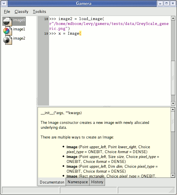
The main Gamera console window is divided into three parts: the Python console, the icon display and the information pane.
Python console
On the right is a standard Python console. You can type code here and it is run interactively. Most operations that you perform using the mouse in the GUI will generate code that is entered in the interpreter here. This code and be copied-and-pasted into your favorite programmer's editor to build Gamera image processing scripts.
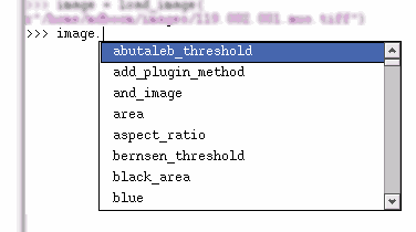
The Python console features auto-completion. For example, load an image and store it in the variable name image. Type image. in the console, and a window will appear showing all of the (many) members and methods of the image.
Icon display
On the left, all active image objects (displayed as icons. When you load images, they are displayed here.
The icon indicates the pixel type of the image. See Image types for more information on the different image types in Gamera.
A magnifying glass appears over the icon if the image is a subimage of another image. It acts as a warning that any changes made to this image will affect another.
The icons are as follows:
Image SubImage Description RGB (24-bit color) GreyScale (8-bit) Grey16 (16-bit) Floating-point image One-bit (binary)
There are other things that can appear in the icon display as well:
A list of images A connected component A classifier object A non-interactive classifier object
Context menu
Right-clicking on any of these icons brings up a context menu to perform operations on an image.
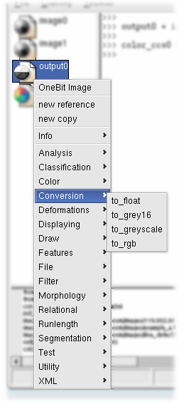
At the top of the menu, the pixel type is displayed.
The next two items are for creating new references and copies of the image. You will be prompted for a variable name for the result.
The Info submenu displays basic information about the image.
The rest of the context menu contains plugin methods, sorted by category. The plugin methods are documented here. Many of the plugin methods require arguments. In that case, a dialog will be displayed. This dialog includes a brief description of the method, if available. For example the dialog for erode_dilate is:
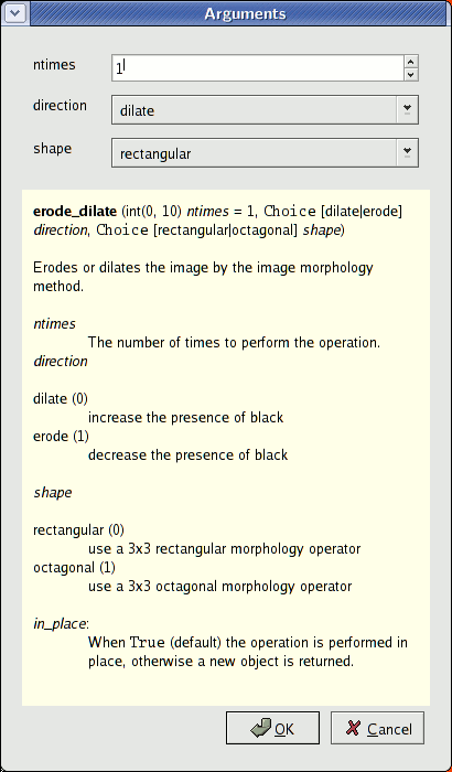
After entering the arguments for a plugin function, code is generated to perform the operation and automatically run in the console:
>>>image.erode_dilate(5, 0, 1)
Information pane
The information pane includes three modes, selectable via the tabs. (These tabs will appear at the top of the information pane on Windows and Mac OSX). This functionality is adapted from the PyCrust project and should be familiar to users of that tool.
Documentation
The documentation pane displays the docstring of the object that was last typed in the console window.
For an example, type "Image(" in the console, and the docstring for the Image constructor will be displayed.
Namespace
This is a "namespace browser" which displays the objects in the namespace of the console in a tree like view.
For an example, type x = 5 in the console, and then find the variable x in the locals part of the namespace tree.
History
History contains a command history that can be copied-and-pasted into an editor to develop scripts.
Image display
Double-clicking on the image icon will display the image in its own window. Alternatively, you can use the display method:
>>>image.display()
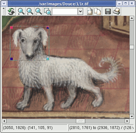
Rectangular regions of the image can be selected by clicking and dragging a bounding box on the image itself. The selection can be modified by dragging the drag boxes in the corners of the selection.
Right-clicking on the image brings up the same context menu as in the icon display.
The image display toolbar has the following buttons:
Force a refresh of the display, in case any change has occurred to the image. Zoom in. Actual size. Zoom out. Zoom so that the highlighted region is fit to the window as closely as possible. Zoom quality
- low quality
- no interpolation
- medium quality
- linear interpolation
- high quality
- spline interpolation
Create a new subimage from the currently selected area (or the entire image if there is no selection.) Create a new copy of the currently selected area of the image (or the entire image if there is no selection.) Saves the image to a file. Prints the image.
Note
On Linux and OS-X, the Print command works by printing to a PostScript file and then sends the result to lpr. Because of this, it cannot properly detect the resolution of the printer. Therefore, a reasonable default of 720dpi is used. Future versions of wxPython may handle this better.
Multiple image display
Double-clicking on a list of images in the icon display brings up the multi-image display window. Alternatively, you can use the display_multi function:
>>>display_multi(list_of_images)
Images are displayed in a grid. By default, the images are sorted so the grid takes up a minimum amount of total space.
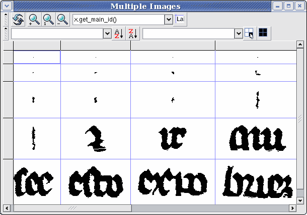
Images can be selected by clicking on a cell in the grid. Individual cells can be added to the selection by Ctrl clicking. Ranges of cells can be selected by Shift clicking.
The context menu can be used to perform operations on multiple images. Right-clicking on a selected image brings up the context menu.
The multi-display toolbar has the following items:
Force a refresh of the display, in case any change has occurred to the image. Zoom in. Actual size. Zoom out. Displays a value within each cell. The value is determined by the expression in the drop-down text box to the left of the label button. Within the context of the expression, x represents the image within each cell, and the expression is evaluated to determine the result to display. 
Sorts the images in the grid based on a given property. The property is determined by the expression in the drop-down text box to the left of the sort buttons. Selects the image in the grid based on a given criteria. The criteria is determined by the expression in the drop-down text box to the left of the select button. Within the context of the expression, x represents the image within each cell. When the expression evaluates to True, the image will be selected. Selects all images.
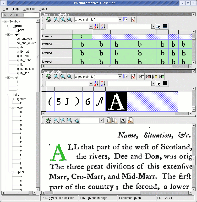
Interactive classifier window
The interactive classifier window is the most involved part of the Gamera GUI. It is where you can train the Gamera classifier to recognize different symbol types.
A tutorial introduction to training image data is given in the training tutorial.
Concepts
Before the parts of the classifier window are discussed, some general concepts should be understood.
Glyph collections
In the classifier window, there are two sets of glyphs (connected components) involved: one in the classifier and one for the current page:
- Classifier glyphs
- The set of glyphs used by the classifier to make guesses about unknown glyphs. The classifier glyphs work "behind the scenes".
- Page glyphs
- The set of glyphs on the current page.
When glyphs on the page are classified by the user, they are copied into the classifier. When glyphs are deleted or renamed in either collection, they are updated in both places.
The number of glyphs on the page and in the classifier are displayed in the status bar at the bottom of the window.
Coloring
When connected components are displayed in the classifier, they are colored according to how they were classified:
Color Constant Description (white)
UNCLASSIFIED The connected component is completely unclassified. (red)
AUTOMATIC The connected component was classified by the automatic classifier using training data. (yellow)
HEURISTIC The connected component was classified by some heuristic (non-exemplar-based) process. (green)
MANUAL The connected component was classified by a human.
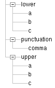
Class names
"Class names" name a particular class of symbols. Class names are made up of period-delimited parts so that they can be grouped into categories. Names can be invented on the fly.
For instance, if you were training for a subset of the characters in the English language, you might have the following class names:
lower.a
lower.b
lower.c

upper.a
upper.b
upper.c

punctuation.comma
These period-delimited parts are used to create a tree-like structure in the classifier window that might look something like:
Special class names
Special class names begin with an underscore (_).
- _group
- Glyphs trained with names beginning with _group. are first grouped together and then trained as a single unit. For instance, you may wish to train lowercase i's (which are made up of two connected components) as a single logical unit. Select both parts (by dragging a bounding box around them in the original image display) and then train as _group.lower.i.
- _split
Glyphs trained with names beginning with _split. are run through a given splitting algorithm. For instance, glyphs that need to be broken into upper and lower halves for further classification of those parts would be trained as _split.splity. When the automatic classifier encounters glyphs that most closely match those trained as _split, it will perform the splitting algorithm and then continue to recursively classify its parts.
The splitting algorithms are documented here.
New splitting algorithms can be created by writing plugin methods in the category Segmentation.
Parts of the classifier window
The interactive classifier window is divided into three parts: The symbol table, the connected component display, and the original image display.
Symbol table
The symbol table is a hierarchical tree of symbol names that are currently in use. It is preloaded with special class names.
Symbols can be trained by typing the class name in the text box at the top or double-clicking on a class name in the tree. The text box features auto-completion (similar to the Unix shell), so you can type a partial name and then press the <Tab> key to attempt to complete it.
Connected component display
The connected component display is made up of two collapsible displays. To expand or collapse the panes, use the + and X buttons in the panes' title bars. By default, only the page glyphs pane is displayed.
Note
Training will run much slower with the classifier glyphs displayed. It is recommended that you leave it closed unless you are interested in what is there.
The connected components panes behave identically to the multiple image display, with additional functionality.
When connected components are selected in the page glyphs pane, they are highlighted in the original image display below.
The background of connected components are colored based on their classification state. (See coloring).
There are some additional toolbar buttons:
Deletes the selected connected components. They will be displayed with a red-hatching pattern to indicate they are deleted. Re-sorting the connected component display will remove them completely. Deleted glyphs are never saved to disk.


Auto-move toggles. Whenever a glyph is classified, the 'cursor' will automatically move to the next glyph that matches any of the selected types: UNCLASSIFIED, AUTOMATIC, HEURISTIC or MANUAL.
Original image display
The original image display, for the most part, behaves identically to the standard image display.
Clicking on a connected component will select it in the connected component display. Dragging a bounding box around a collection of connected components will select multiple connected components. Additional connected components can be added to the selection by Shift-clicking.
There are some additional toolbar buttons:
(Toggle) Display an animated rectangle around the currently selected connected component.
Classifier menu
File menu
Note
If you give any of the XML files a .gz extension, they will be transparently converted to/from Gzip-compressed files. This saving and loading is actually faster!
- Open all...
- Opens a special directory of files containing an original image, and contents of the editor and the classifier. This directory should be one created by Save all...
- Save all...
- Saves all of the data necessary to restore the classifier's state into a special directory. This includes the original image and the contents of the editor and the classifier. This special directory can be reloaded using Open all....
The following options are used to save and load connected components in the Gamera XML format.
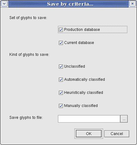
- Save by criteria...
For expert users. Provides a dialog box to save different sets of glyphs to a single XML file.
- Classifier glyphs
- This menu allows one to Open, Merge, Save, Save As or Clear the glyphs in the classifier. (See glyph collections).
- Page glyphs
- This menu allows one to Open, Merge, Save, Save As the glyphs on the current page display. (See glyph collections).
- Save selected glyphs as...
- Saves the selected glyphs to a new file.
- Symbol names
- Import or export a set of symbol names. Symbol names can be imported from a full Gamera XML file containing images, or a symbol name-only Gamera XML file.
Classifier menu
- Guess all / Guess selected
- Classifies the glyphs using the automatic classifier. Glyphs that were classified manually are not reclassified (they must be unclassified first).
- Group and guess all / Group and guess selected
Classifies the glyphs using the automatic classifier, while attempting to group nearby connected components to form glyphs that are more similar to glyphs in the classifier. This process can take considerably longer than one-by-one classification.
The parameters are described in greater detail in the classifier documentation.
- Confirm all / Confirm selected
- Treats all automatically classified glyphs as if they were manually classified and adds them to the classifier. Use this function only when you are sure all glyphs are correctly classified.
- Display contents
- Displays the glyphs in the classifier in a new window. As of this writing this display is read-only and not "live" (i.e. it will not change when the contents of the classifier change). This shortcoming should be remedied in a future version of Gamera.
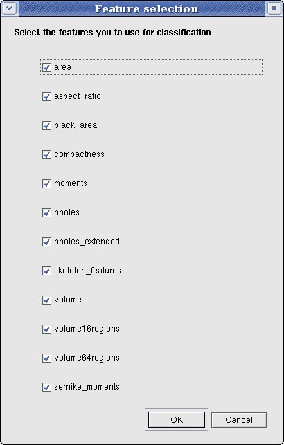
- Change set of features
- Change which features of the connected components are used for classification. The features themselves are documented here.
- Classifier settings
- Allows the settings specific to a particular classifier type to be changed, saved or loaded.
- Create noninteractive copy
- When training is completed (or partially completed) this function will create a noninteractive copy, which is likely more optimized than the interactive version (depending on the classifier type).
- Create edited classifier
This option will show a dialog to create a new classifier with a modified training-set based on the current classifer. This modified classifier is produced by one of several kNN-editing algorithms which the user can chose from. Depending on the chosen algorithm a set of parameters is displayed which can be changed by the user to tune the algorithm's results. Additionally the documentation for this algorithm and its parameters is displayed.
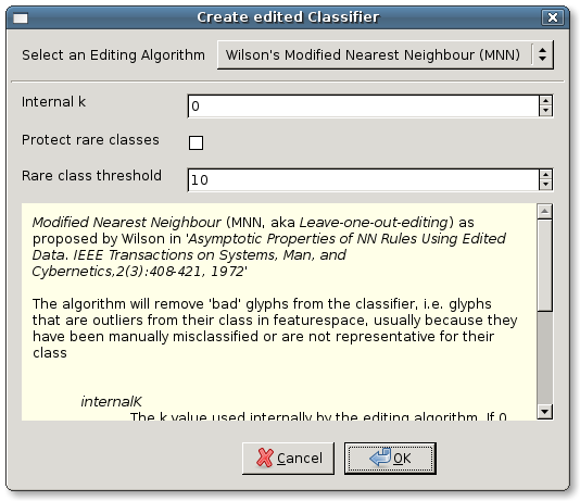
After confirming this dialog, the user is prompted to select a name for the new classifier. The classifier will then be added to the icon display in the console under this name.
The produced classifier is usually improved either in terms of speed or classification accuracy, depending on the chosen algorithms and its parameters. For details about the algorithms, their parameters and how to include your own editing algorithms see the classifier documentation.